TRAVEL WEBSITE
About THE PROJECT
A concept site for travellers to discover new locations to visit around the world. A tool for finding new adventures, where to travel next, where to stay and what to do in a chosen location based on user preferences.
-
Client: Wayfarer (via Designlab)
-
Project Type: Desktop and mobile app
-
Tools: Figma
-
My Role: Designer
Background
Wayfarer will offer travellers a tool to discover new locations to visit around the world whether they are in the planning stages or already on the move. Using data-driven recommendations, the user can receive tips based on their preferences, the type of holiday they are looking for, time of the year, and the experiences they wish to have.
The Wayfarer user is anyone between the ages of 21 and 30 who travels frequently and is in search of new adventures. This tool is perfect for both the doubtful traveler who wants to experience the world but does not know where to start and experienced wanderers who know where they are heading next and need the information to complete their travel plans.
This service can be accessed on desktop, but they can also download the app to use it on the move.

CLIENT REQUIREMENTS
1. A desktop landing page that includes:
-
An intro to Wayfarer
-
Navigation to other pages or sections on the site
-
A simple search functionality to find destinations
-
A grid or list view of featured destinations
-
A CTA (call-to-action) to sign up for the newsletter
-
A footer section with copyright date and links to other pages
2. Three sample screens for an Android app:
-
Screen 1: Sign-in screen
-
Screen 2: Homepage
-
Screen 3: A “detail” screen, giving full information about a destination
MY PROCESS
For my final project, I created a desktop and mobile app concept for Wayfarer. As this project didn't have a user research element, I started my process seeking inspiration and getting ideas of commonly used product categories, UI elements etc. from reputable competitor sites. I also looked inwards, as I used to travel a lot during my 20s (their target market), and I asked myself what used to excite me about traveling. Most of the time, I used to enjoy the process of planning the trip as much as I did the adventure itself. Therefore, I thought the images would need to be aspirational and dream-like and for the web/app to provide information about the possibilities the trip would offer in terms of accommodation and activities, as well as being very easy to navigate.
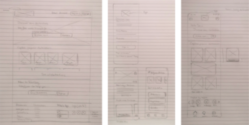
I brought all my inspiration and ideas together into a number of rough wireframes, that later on I had to iterate slightly to consider Android App design guidelines. Looking back I should have done this before setting off to create wireframes.
Desktop/ LAnding Page
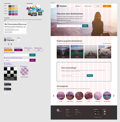
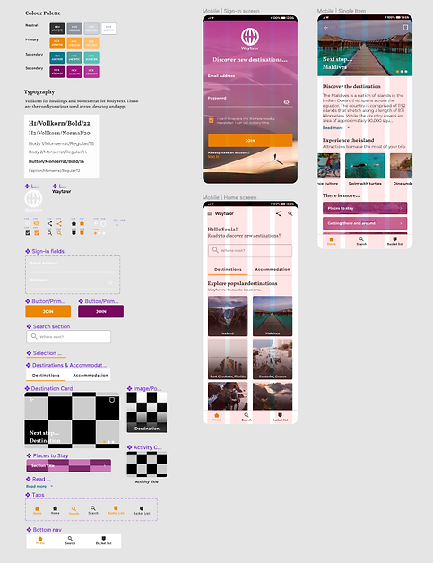
I created a landing page on Figma using a 12-column grid for desktop to efficiently align objects within my frame and provide visual structure to my designs. This was later on translated into a 4-column grid for mobile, helping me to remain consistent across the two devices.
I went for a clean and simple design for users to navigate easily, with a focus on imagery to encourage exploration and retention.
For the colour palette, I chose a triadic combination, resulting in relatively high contrast and a harmonious feel. My colour choices aligned with the feelings I hoped to evoke:
-
Orange is associated with meanings of warmth, heat, sunshine, enthusiasm, encouragement, change, determination, health, stimulation, happiness, fun, enjoyment, balance, freedom, expression, and fascination.
-
Purple is associated with feelings of peacefulness, ethereal, creativity, independence and magic.
-
Turquoise has some of the same calming attributes, and it is associated with feeling refreshed, energised, emotionally balanced and joyful.
I used a contrast checker to ensure the hues used for primary and secondary CTAs were optimum for readability on each device and font size.
For the typography, I used Google Fonts to ensure my choice was supported by popular devices. Vollkorn stood out as a strong candidate to use in headings. I then used the “Popular pairings with Vollkorn” functionality to test potential pairings with San Serif fonts. I found this very useful, saved me a lot of time, and gave me confidence my selection would work. I opted for Montserrat for the body text.
Starting from the top navigation, we have:
-
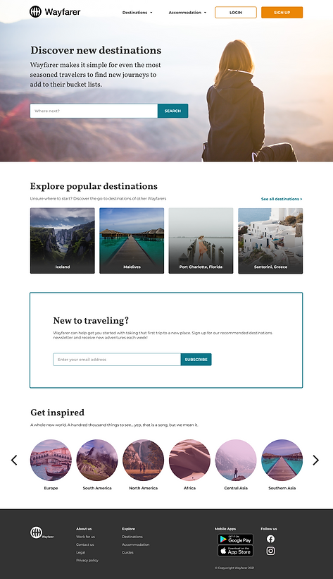
The Wayfarer logo displayed in full, including the brandmark as it is a larger screen size. In contrast, the app only displays the wordmak.
-
Users can sign up or login if they already have an account, to unlock additional functionality and a more personalised experience.
The hero section...
-
Introduces the Wayfarer brand, so users know what to expect
-
Offers a simple search functionality to start browsing as soon as they land on the page
-
Aspirational imagery is used as background for this section to encourage them to browse
The section that follows is thought to help those who may not be ready to do a search. They may simply not know where to start and that is ok! "Popular Destinations" hosts a list of the hottest locations other users in the platform have explored and travelled to. They can also "See all destinations" for the full list. I added a gradient overlay over the image to ensure the text could be readable.
As required by the client, I added a section to encourage them to sign up to the Wayfarer newsletter. This would be crucial to engage new and existing users and bring them back to the web/app in periods of inactivity.
Additionally, they can explore destinations by region to get inspiration for their future adventures.
The footer includes more information about the company and quick links to other sections on the website such as destinations, accommodation, and guides. There are also links to download our mobile app and follow us on social.
MOBILE SAMPLE SCREENS
I created the mobile screens on Figma translating the original 12-column desktop grid into a 4-column grid for mobile.
The Sign-in Screen
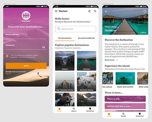
This screen welcomes the user when they first download the app. It is designed to make the onboarding process as easy as possible. The user can create an account, simply inputting their email address and desired password. As part of the onboarding process, the user can check the box to receive the newsletter.
The design uses the secondary colour palette to create a gradient effect over the background image without totally covering it, driving the attention to the main CTA, "Join". In this instance, I used the white version of the logo for better contrast, and also a version with a larger brandmak as the design allowed more white space around it.
The Home Screen
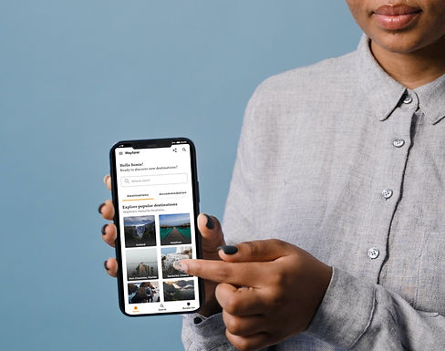
This screen would have a personalised message to welcome the user, addressing them by the name they used to register. Unlike the desktop version, you can only access this screen once you have signed in or logged in. For that reason, there are no buttons to do so.
Here, I chose the wordmark to ensure the brand is visible but not overly prominent. Users can access the full menu tapping on the hamburger menu, share the app with friends or search the app using the search icon.
Similar to the desktop application, the user can search for new adventures using the search functionality or explore popular destinations by country and region.
Usability was improved throughout the design process with the use of:
-
Subheadings introducing the different sections
-
A bar that slides under "Destinations" or "Accommodation" to indicate which section was active
-
Different colour for idle and active icons
The bottom navigation is sticky to have access to the homepage, the search page and their own bucket list, populated with all the destinations they save throughout their visits to the app.
When selecting one of the destinations, the user is presented with the Detail Screen.
The Detail Screen
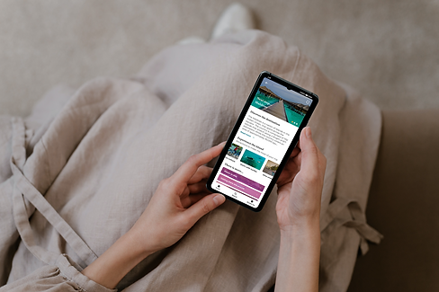
Provides the user with curated information about a specific destination from the "Explore popular destinations" and "Get inspired" sections.
The hero offers the option to return to the previous step tapping on the back arrow; add the destination to their bucket list, which is always accessible on the bottom nav as well; and browse through a gallery of enticing images from that destination.
This screen mostly caters to a user who is on the go. Here, they can scroll through attractions that will help them make the most of the trip, find where to stay and how to travel around, for example.
WHAT I LEARNED
-
Creating a few screens is a good way to provide the client with the look and feel for the product.
-
When working with a real client, it would be key to ask as many questions as possible about the user and how they intend to use the web/app. Knowledge about personas and any market research that had been done prior to the design stage, would aid the design process. If this isn't available, conduct interviews with user groups to target.
- As the experience is different for first-time users and registered users, as well as users in the planning stage and on the go, explaining the user journey requires the design of additional screens, outside the scope of this project - mapping out user journeys and possible flows would help in finding any painpoints or inconsistencies.
- Using autolayout design efficiently and to ensure consistent spacing between components and padding throughout.
- Using text and component properties to:
- Show/hide layers
- Swap instances: Icons, other components...
- Easily edit text in sections, buttons, etc.
- Check the Android App design guidelines prior to starting the design process will save me a lot of time and ensure compliance.
