FASHION ECOMMERCE
MOBILE APP
About THE PROJECT
A new eCommerce clothing brand for young professionals looking for fashion-forward and affordable looks. I designed their visual identity embodying their philosophy and the values shared by their target customer., which was later translated in the design of 3 screens.
-
Client: Modura (via Designlab)
-
Project Type: Logo and mobile app design
-
Tools: Figma
-
My Role: Designer
BACKGROUND
Modura is a new eCommerce clothing brand designed for trendy men and women between 18 and 25 years old. These individuals are early in their careers and are looking for an affordable solution for business casual clothing to wear to their jobs in urban areas. They are fashion-forward, and conscious of trends. They want to dress for the jobs they want without appearing overdressed.

CLIENT REQUIREMENTS
This project was broken down into 5 mini projects, leading to the design of 3 app screens. I was asked to:
-
Develop sketches of 3-4 distinctly different logo directions for the brand, as well as digitisation of two logos
-
Conduct competitor analysis, with a focus on colour
-
Create two colour sets
-
Choose two font pairings
-
Create a style tile
-
Design app screens: Home, Search and Detail
Logo sketching & digitising
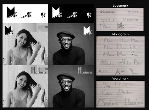
I developed sketches of wordmark, monogram and logomark designs. From the initial 3-4 distinctly different logo directions, I chose 2 of the design concepts:
-
Logomark showcasing the letter "M" with gender icons other than just female and male, to depict a gender neutrality, forward-thinking brand. This was initially my preferred choice.
-
Wordmark with a simple design composed of vertical lines
I digitised them in Figma using text, shapes, and the Pen tool, as well as, experimenting with different line weights and proportions. I delivered responsive configurations of the logos as displayed in the image above to be used in smaller screens (mobile), marketing collateral, or as favicon.
Once I was satisfied with the result, I looked for two people who could serve as ambassadors of the brand: young (18-25), trendy, fashion forward dressed to work (biz casual). I placed the logo over their image to show the client how it could look in both black and white versions.
.png)
Competitor Analysis
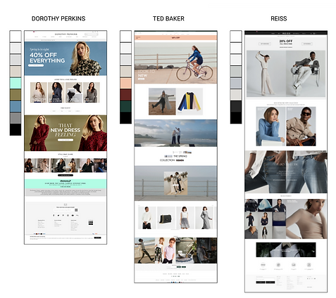
I began by analysing the competition to identify colour trends and best practices within the industry. I focused on three brands that seem catered to a similar target audience:
.png)
These three examples seem alike in their use of colour, white for backgrounds and grey hues to divide sections, create depth and as backdrop for product and models.
I also observed, the primary actions didn't stand out too much, with buttons carrying white or black. Dorothy Perkins and Ted Baker use a secondary colour to highlight promotional elements and new collections. By not using strong colours, the focus is placed in the clothing, which stand out against the light/dark hues of the page. They appear to want to guide the shopper around the website without visually overloading them with a multitude of tones. On the flip side, they seem to lack individuality due to the lack of them.
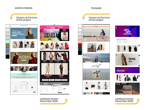
Update (November 2022): Looking at both Dorothy Perkins' and Ted Barker's sites now, they have incorporated more vibrant colours to their palette.
Colour SetS
After analysing the competition, I created two colour sets that would align with the values that represent the Modura customers:
"Thriving young professionals entering the workplace and seeing the world of business with fresh eyes. Bringing new energy, knowledge and determination for success. Excited about this new chapter of their lives and aiming to balance work with an ever active social life."
Each set included a primary colour for their app screens, a secondary colour to highlight, action, or as accent colours, and a neutral palette to be used for the screens backgrounds as well as text.
As I considered the feelings I sought their brand colours to evoke, I decided to create a photo collage with images that represented their target audience. I then used the Material Design colour tool to help me refine the colour choices, which I then imported into Figma.
I also created a word cloud showing what the colours represented, as well as a short description of the customer and the values I was trying for each colour palette to be associated with.
.png)
For the first palette, I chose orange as the primary colour aiming to evoke enthusiasm, happiness and affordability, the latter being important for these professionals as they are just starting their careers. I chose blue as a secondary colour to convey work-life balance. This colour represents productivity and business, but it also denotes peacefulness. It is also associated with trust and confidence, customers may gravitate to this hue when seeking a brand they can trust.
For the second palette, I chose blue as the primary colour to convey the values highlighted previously, as well as green for the secondary colour. The colour green is associated with nature, growth, freshness, and balance which are also values that align with Modura’s product offering — trendy, fresh and conscious with their environmental impact, aspects that resonate with their customers.
TYPE
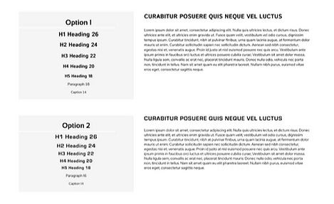
I selected two different font pairing options for the headings and the body text, considering readability and usability above else.
I began by browsing fonts from the Sans Serif family Google Fonts Library. These fonts are known to be suitable for on-screen use due to their characteristic clean lines and sharp edges, making them legible for users.
I identified two pairs which could go together and used what I thought would be an adequate weight and kerning for each heading and body text respectively:
-
The first pairing uses Istok Web, bold for headings and Fabrica for body text.
-
The second pairing uses Eurostile, bold with 6% letter separation for headings and Red Hat Display with 1% letter separation for body text.
Please, see below the text in use...
Style TIle
Before designing the screens, I brought all my work and the decisions that have been made together into a Style Tile for or stakeholders to be able to visualize the way the site or app may look like or guide for other design teams working on the project.
The included an overview of the brand, the logo, icons, imagery and brand keywords, photography style and photo treatment guidelines, colour palette, typography, and UI elements. I also included notes that explained my thought processes.

Please, click the image to zoom in on the different sections
APP SCREENS
For this project, I created 3 screens:
1. Home Screen showing latest offers on garments
2. Search results Screen, showing a selection of items for a particular search
3. Detail Screen providing additional information of an individual item of clothing
Additional to the initial competitive analysis, I used websites like Dribbble and other competitor sites for inspiration. I paid special attention to key UI elements that are commonly used in these kinds of apps. I then sketched my designs on paper.
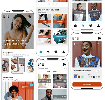
Please, click the image to zoom in on the different sections
WHAT I LEARNED
-
Consider logo scalability so that it continues to look good and remain legible at any size. I encountered this issue when I added the logomark to the interface, losing impact and readability when scaled down. To improve accessibility, I modified the wordmark with slightly thicker and fewer lines.
-
Choose commonly used icons that people recognise to ensure ease of navigation.
-
Putting icons in their own frame to make sizing consistent.
-
The colours used for buttons and category tags had to be adjusted slightly to ensure better contrast and legibility.
